Unit 5 - 8/12/16 - 1/17
unit 5 pathways, I have chosen illustration as my pathway choice. for this unit we will be studying and experementing new ideas within Alphabetics, Looking at the Science of the alphabet, letters and possibly language. I am to test out new materials and techniques within this unit, recording anyhting i happen to descover in my journey, expereimenting with a body of work to apply and develop knowlege to a brief. to use technical termanology, Explore the potetnial of materials. e.g Using heat or cold or anyhting else. I need to set myself targets each week. and find out what effect things have within my project.
-Locate sources. primary/secondary .
-Research and revise creative intentions.
-Locate sources. primary/secondary .
-Research and revise creative intentions.
What is Vaporwave?
Vaporwave Is an internet subculture, started in the early 2010's and is Known for it's 80's and 90's distopia sounding music, Often distorted and decaying in sound, Art and fashion brought into the modern day time, yet the style is massive throwback to earlier days. there is a massive emphasis on neon visuals in its art, and use of old 3d graphics and ugly shapes and colours as its "aesthetic" it's a movement of ironically nostalgic music and visuals.
My mission
|
My mission or brief, Is to explore a range of ideas and possibilities, Utalising Vaporwave, to research, critique work, anylyse and eventually come around to creating my own origonal work based on what I have learned presented to me. Within this genre i intend to delve deep into the deep hidden messeges of Various Vaporwave arr and the artists themselves. Because it's more than just a quirky and niche internet subculture. they have messeges burries within. all art does. there;s got to be a bigger meaning under the nright colours and neon lights. My first thoughts were consumerism. why? Well. In my research below you will see that a lot of Vaporave carries a few themes. Brands. logos. Producs. they use the convinient use of aesthetic in their wok from the 80's and 90's as Tags and Labels for their work. perhaps creating an emhpasis on producs that we buy. to be a human in the modern world is to buy into what corporations give to us. the strange use of products, Aesthetics, sounds and technology from both the 80's and 90's is important to note because it really enforces the nostalgia.
|
Secondary research.
This is a video by youtube user Misteramazing. ( https://www.youtube.com/channel/UCUG9w-kUDyIenbVnldsa6ug) this is his in depth discussion video (documentary style) about why people are so attracted to this bizzare Genre of art, and the mindset behind it. I found this as a good secondary source to back up what I've already stated before. (found on the 2nd jan 2017)
A quote to keep in mind: 4:49 " which emplores us to endulge in the consumerist culture of the 80's and 90's while at the same time exhorting us to reject it" Vaporwave has heavy emphasis on the Ironic and satirical use of Brands and products in its art. it always has been a playful jab and embrace of the captialist culture at the same time.
A quote to keep in mind: 4:49 " which emplores us to endulge in the consumerist culture of the 80's and 90's while at the same time exhorting us to reject it" Vaporwave has heavy emphasis on the Ironic and satirical use of Brands and products in its art. it always has been a playful jab and embrace of the captialist culture at the same time.
Take a listen to this music take a look at the acomanying cisuals. what does it mean to you? - let it run while you read the rest of this page.
ALEXANDRE OPIPARI -japanese alhpabetics
|
"I’m Alexandre Opipari a Brazilian visual communicator,working with print design and art direction.
I was born in 1990, Generation Z, as a child I soon received an analog camera from my father, and with that in hand I started to think and create images. The graffiti scene in São Paulo is very strong, which made me develop a passion for colors and shapes in high school. This whole scene helped me choose a profession years later." https://www.behance.net/aaop Alexandre Opipari is a Brazilian artist from the city of Sau Paulo. he created this gif to represent Tokyo in the briefest way. It was part of a collection known as "20 Tokyo GIFS from around the world" and as you can see, he has taken iconic images such as the gameboy, Shushi, Pikachu and other symbols to quickly |
flash past on the screen, these in their entirety are good indicators of what life is like in japan, when I see my eye is drawn to the centre, the colours that i am presented with, pinks, yellows, blues, peach, blacks and reds wether it be in the background or the detail. the use of the lettering in the corner intermixing with one another really show off the different letters used in the word "tokyo" I chose this artist becase he, like my other Artist uses products and popular logos to communicate the messege; that messege being japan as a place. moving onto more relevent matters, it is the man made products and labels that makes Tokyo what it is, what it has brought to the world and what we al know and love about the country. http://en.rocketnews24.com/2014/05/01/20-tokyo-gifs-from-around-the-world/
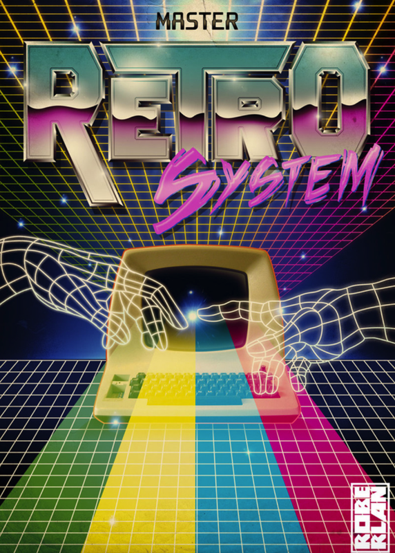
Roberlan Borges
|
http://www.roberlan.com
"Since I was a kid, two things have always fascinated me: technology and vintage art. I’m fascinated by all kinds of vintage things, such as photography, art, painting and cinema. The first thing I remember drawing was punks with mohawks, camcorders and old cars, but don’t ask me why. I wish I still had some of those old drawings made on notebooks, but I don’t even know where I would begin to look for them. As I grew up I stopped drawing camcorders, but the retro / cyberpunk / technology subjects continue to inspire me to this today." I found this image on pinterest.com as part of a board on retro typography, It however lead me to the origonal artists personal site and in turn sourced that instead. |
|
Roberlan is a fan of the retro and cyberfunk movements. a lot of his art is inspired by things fromt he past and was introduced to retroart in the late1990's. When i look at this peice of art i am most drawn to the hands and the computer, the colours and lines leading away is where i would say my eye is lead to next. the great use of bright, vibrant colours on the dark backgrounds really gives me that futurefunk, cyberpunk theme, the two hands in the middle is an obvious reference to michealangelo's Creation of adam. this to me speaks columes, this could represent man's creation of technology ( the computer in the background) how far we have come as a species and what we have achieved thus far, the colours keep it cheerful, hopeful in my eyes. technology is osmething we ought to be proud of, it's our guiding light into the future. however as you can see this is a retro based peice of work, and so, this is sort of based on the past at the same time. the computer is visually old. perhaps telling us that although we've ocme so far. we still have a long way to go, or that no matter what we create, some day it will become old and outdates. we are the creators now. we are gods in our own right. creating content and crafting technology.
Vapor optics
|
Vaporoptics -http://vaporoptics.tumblr.com |
Vaporoptics is a vaporware artist who works on visual effects and editing photographs. their techniques consist of working in photoshop, editing pictures of old technology to look like it has come straight from a moment in time from the 90’s. often distorting the pictures, using popular technology of the time and even colours that may have been used more, what’s more important is the emphasis on technology and nature, the two often come hand in hand as being opposites, that is why they work so well together in one picture, what I most like about it is the use of colour. particularly in the pastel area, they use pastel blues, Pinks, purples and greens to make certain objects such as computers, TV screens and plants pop in the art. their use of screens in line with technology really helps to get across the message that both are significant in this world, the rounded, shiny objects that look like they come from outer space on a natural background really help to emphasise this. they also use letters in their work too, Title prints, Slogans are good use of alphabetics, as it sort of links back to man made things. language being one of them. and the pictures below are some of my favourite picks from this artists, and the pieces of work it think i would benefit from the most when creating my own work.
I think i could incorporate this style into my own work because I like their emphasis on technology and old things. I like the older colour palette they’ve gone for and how they’ve aged the art beautifully. Especially in some pictures i’ve saved here, you can see a bold use of line which i Really love.
I think i could incorporate this style into my own work because I like their emphasis on technology and old things. I like the older colour palette they’ve gone for and how they’ve aged the art beautifully. Especially in some pictures i’ve saved here, you can see a bold use of line which i Really love.


An interview with Vapor optics.
I had managed to track down this Mysterious artist over the internet, (which I for one find an interesting link that connects us, with the theme of internet, and alternate realities.) and was able to Ask him some Questions Regarding his Influences, his use of technology, His message and his themes. his response is very interesting, as it reflects the very same values I have for it. it made for very interesting Primary research as It backs up points that I have already made, it seems to be personal values that many Vaporwave artists share together, within the community.
"To me, vaporwave is an artform which uses elements such as slowed do music samples, old CGI, japanese typography, and 80's to 90's culture references to evoke a sense of nostalgic wonder, something that feels close to our hearts but foreigin at the same time. This can be either audio or visual, and is often presented as a combination of both.
I guess one of the things I'm trying to communicate is that we are living in a transitional period, and the road to the digital age going to seem more and more distant the faster we become dependent on technology. I grew up in the ninieites so i was still able to live in a time where the internet wasn't the center of peoples social life and spent alot of time outdoors. This is why I tend to use plantlife and glitches in a lot of my art, partly because it fits the aethestic of vaporwave, but also to establish a link between technology and nature which is often overlooked..
I use a combination of maybe 3-6 iPad apps (Matter, Union, Glitche, ect.) and photoshop cs6, depending on what I'm working on.
I started out doing a lot of analog collage, so just building layers using various glitches and filters, exporting PNG files, and scanning magazinbes is what I'm most comfortable with. I also use a pretty basic 3D modeling app called Matter which is a lot of fun but kind of limited.
My biggests influence would have to be vaporwave culture/music, cyberpunk novels, and 90's video games. And of course the amazing art I see from others on Tumblr/Insta.
-Vapor.Optics"
First experiments.
Here was my first play around with Bold lines and this new Vaporwave style back in early december 2016. What I like about this piece most is the cold lines and use of japanese lettering, it's well placed in the picture and is very bright, which I like because it makes the picture stand out, which is the point of this kind of art. this was an expereimental sketch because i'm testing different media with this kind of style of art, It was just a way of getting my ideasdown, and I may not be done with this piece yet, I might develop it into a photograpic piece or maybe a gif. To link back iwth my previous work I can try and make it a moving peice. What i could improve on is perhaps my font on the english letters. the writing was hand drawn if you look closely and looks a bit more messy in comparison to the rest of the art. all in all however this was a good expereiment and communication of ideas, I like the use of colours in the background as well so i will take that forward into my next piece. This work draws influence from the colour shemes of my research, plying on themes of nostalgia, Technology and consumerism. As you can see, Computers are a form of escapting reality. Most homes have one these days, Bought to improve your life with social media and games. I incorporated the older computer "look" to inform that theme of nostalgia, We know that older omputers can't do even half of what modern ones can, but it's an amusing thought that we were once satisfied with the technology presented to us in the past.
Brainstorm of ideas
Here were a few sketches I had done, simply putting down ideas that I may or may not end up using. The first was going to be a chrome person surrounded by logos and internet websites, the second was a man coming out of thecomputer after haivng apprently being sucked into the virtual reality. the third is going to be a gif of a stationary computer with lotfs of products and other images flashing on the screen, combinging odd objects aurrounding it like plants and a statue which is very contrasting, i like that and would like to use more of it. the fourth was goign to be a sihlouette full of brands, symbolising what it means to be a human being in the western world. our personalities are based around what we wear, what we buy, and the itnernet.


Continuing experments.
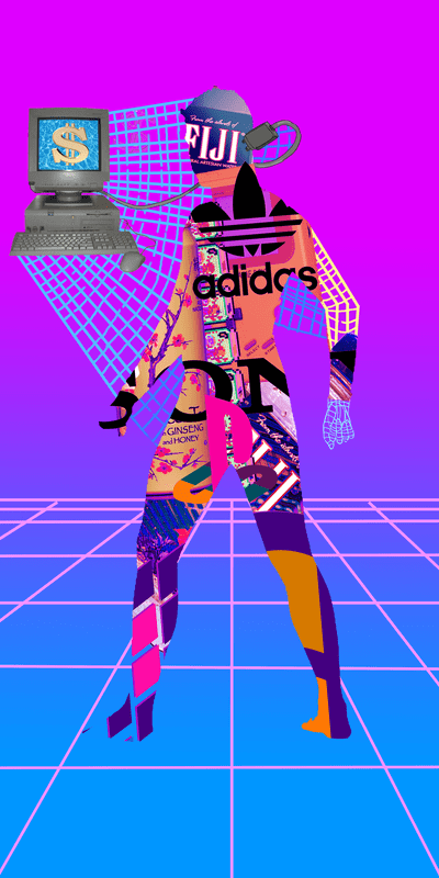
How did I create this image?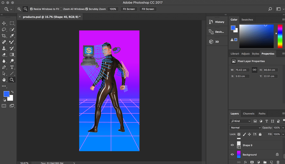
|
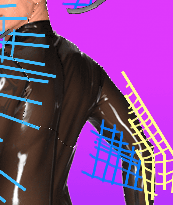
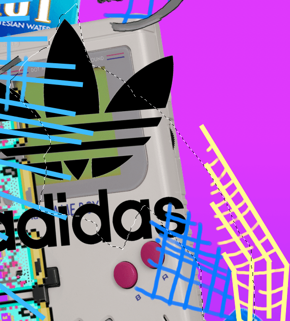
Here is another experiment of mine, where i was using different techniques in photoshop to create a mix of images layeres over a silhouette of a man. this image was taken from my brainstorm sketches, As i was talking about earlier, the man being connected to the internet ( social media, the piblic eye) and branding himself with all sortf of different products and names, which is what bieng a human being is all about in the western world. we base our whol world around what we buy to define who we are, we use the internet to fuel our need to do more of this, we purchase through the internet, and pry ourselves and others, it really is a powerful tool that is the pinnacle of human existence. nothing else matters but this virual plane. everything we do and everything we are revolves around technology and the itnernet. I challenge anybody in the modern world to keep up without it. is it a good or bad thing that we obsess over the things we buy to make us who we are? as long as you are happy with it, it seems to be a good thing. like is simple and short. if you are content with this lifestyle, more power to you. the floor he is standing on reminds me of lines of code in the internet. the same sort of use of line that is connecting his body to the computer. like a web.
____________________________________
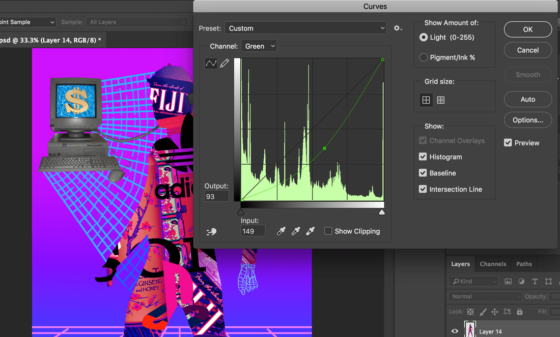
Step1: Using google images I pulled a picture of a man in latex ( to entire a smooth sihoutette line) into photoshop. as you can see i've lined him up nicely. it doesn't matter too much what he looks like, as we're simply using his form, and nothing else. I hand drew the lines and the background In to see if it all fit. This is the Quick selection tool. it can be found under the corresponding dumbol, along with the Magic want tool. Using it is a lot better than the regular selection tool as you can see below. As you can see the quick selection tool really works well here because it snaps to the point at which the picture ends. the dotted line represents parts which i've selected. it conviniantley lines up with the pictures transparrent boarder, allowing me to selects the whole figure in one dragessentially. this will make for an easier clean up and a bolder silhouette. next step is to collet some brand logos, some of the more commonly known ironic "vaporwave" products like fiji water, Arizona ice tea, addidas and gameboy. what I had done next is layer the overlapped products over the election of the man and swap the layers around, the selection shape of the man reamains, however the focus is on the laters with all the products now, so we can edi them more easily. I then copied the selected area into my cipboard, taking all the brands in the shape ( cutout ) of the man. After copying and pasting the full image of the man, it was still missing that traditional colour, It was time i manipulated the RGB levels of my finished image to make sure it looks good against the background. the RGB curces allow me to bend and twist the Red, Blue, and Green ( RGB) colour shemes of the peices, putting more emhpasis on each if i so chose. I picked a Colour that I preffered, I tihnk it brings out the best in the whole picture. |


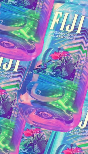
The fiji water bottle conspiracy
These picture of fiji water bottles may seem out of place, However they have a very important connection to everything we have talked about so far, not to mention that it's a brand, created in in 1996 by canadian businessman David Gilmour, fiji water was an obscure and interesting product of the 90's, it's used a lot in vaporwave art today because it's sort of a rediculous product. Why is fiji water better than regular water? why is it so expensive for something we can get anywhere else? they tell us it's from fiji but can we really believe them? We see famous people using it , possibly because they have more money and can affoard to flaunt the more expensive water brands. but it's water. the most basic liquid to keep us alive, hy would we pay more money for it if it's in a different container? Because of this question the 1990's fiji water bottle has been marked down as one of the most prominent products of Vaporwave imagery and art. it's just another brand, it's aesthetic container has been put in mny different peices of artwork, It's golden font and use of tropical plant imagery on the container makes it seem very beutiful to perhas heighten it's eliteness over regular water bottle containers, even though there's just water inside, there is no real prize.


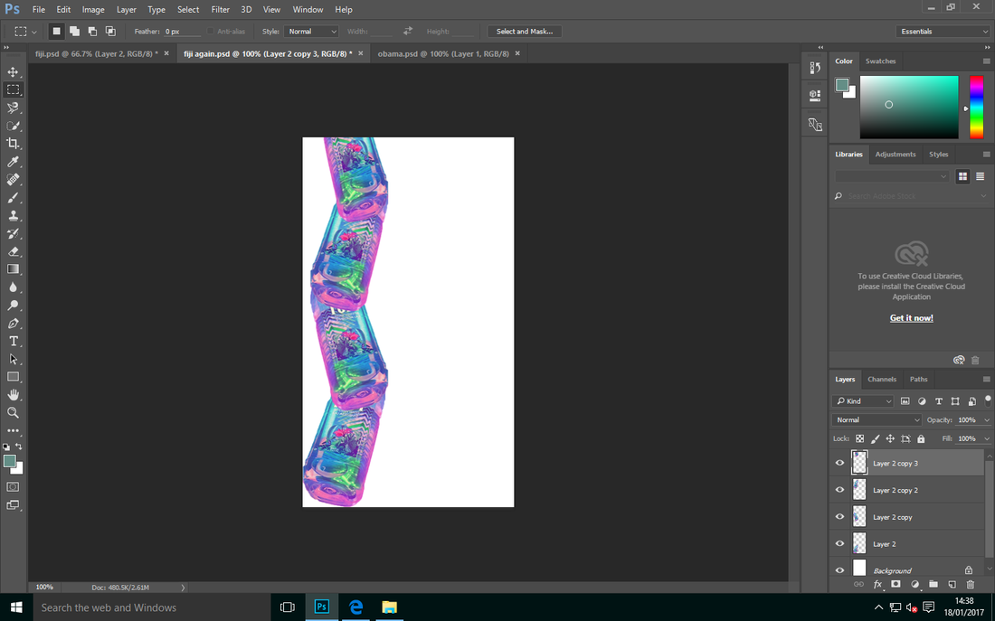
Fiji repeating
I have used photoshop to create this repeating pattern of Fiji water bottles. I have enhanced the colours so they are more reminiscent of blues and pinks with the lasso tool allowed me to crop the picture and to manipulate it, holding the "alt" button I am able to instantly clone the image and creating a new layer.
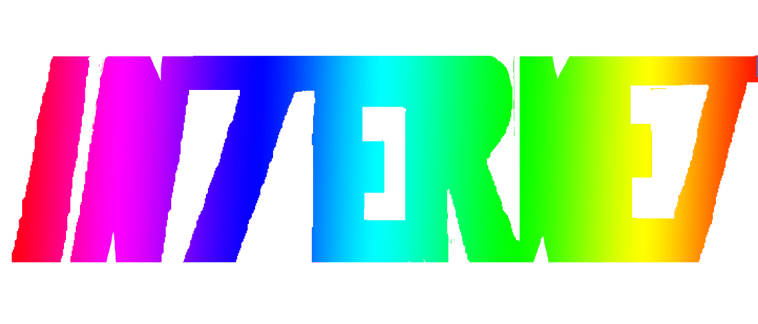
Acknowledging Failures
in this particular experement I had cut out cardboard, int he shape of different letters, that spelled out "internet" i decided to focus on this phrae because it's a medium sized word that takes up a nice amount of room on a page whcih draws in the eye, Aside form that the word has so much power in our world. I wrote the word backwards to be cut out because we know that printing something always prints it backwards. what i wasn't aware of however that cardboard gives under pressure, it distorts and bends, letting paint slip in between the cracks and distorting the work. I did not keep this in mind when performing my experment, and seeingmy result you can tell that my prints did not work out, they either print way too much, making the print claggy, and unreadable, i tried using less paint but the parts of the cardboard that were already crushed didnt press the paint down enough, leaving gaps, thus rendering it unusable.


Gif experement
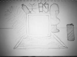
A quick mock up drawing of my idea, focused on central placement of objects, as if they are sitting on a plat surfce. thinking about including some obscure statues, plants and the fiji water bottle I have been looking at. i want image of my art to flash up on the computer screen. the japanese writing means "aesthetic" . i used this phrase because the objects are very obscure, they aren't often seen as beutiful, computers and plastic water bottles that is.
I import my image into Adobe photoshop
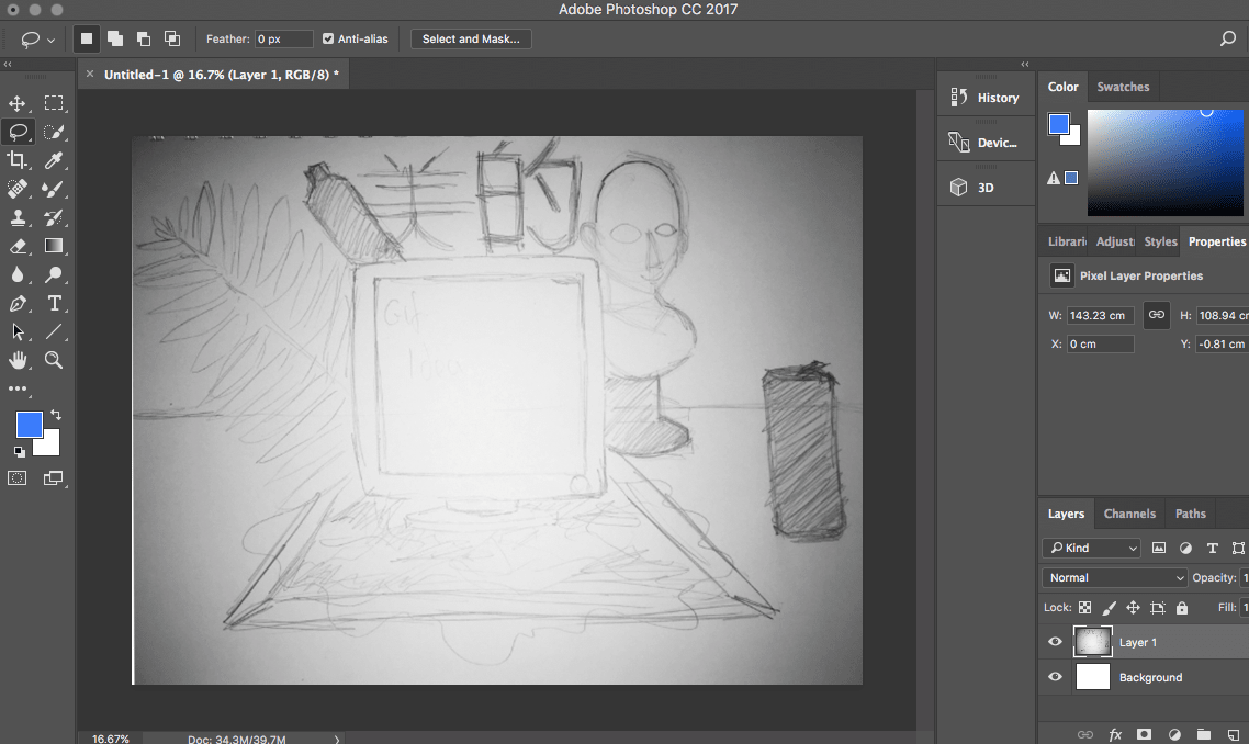
I draw over the pencil lines to make sure I can se everything. re-inforcing the idea.
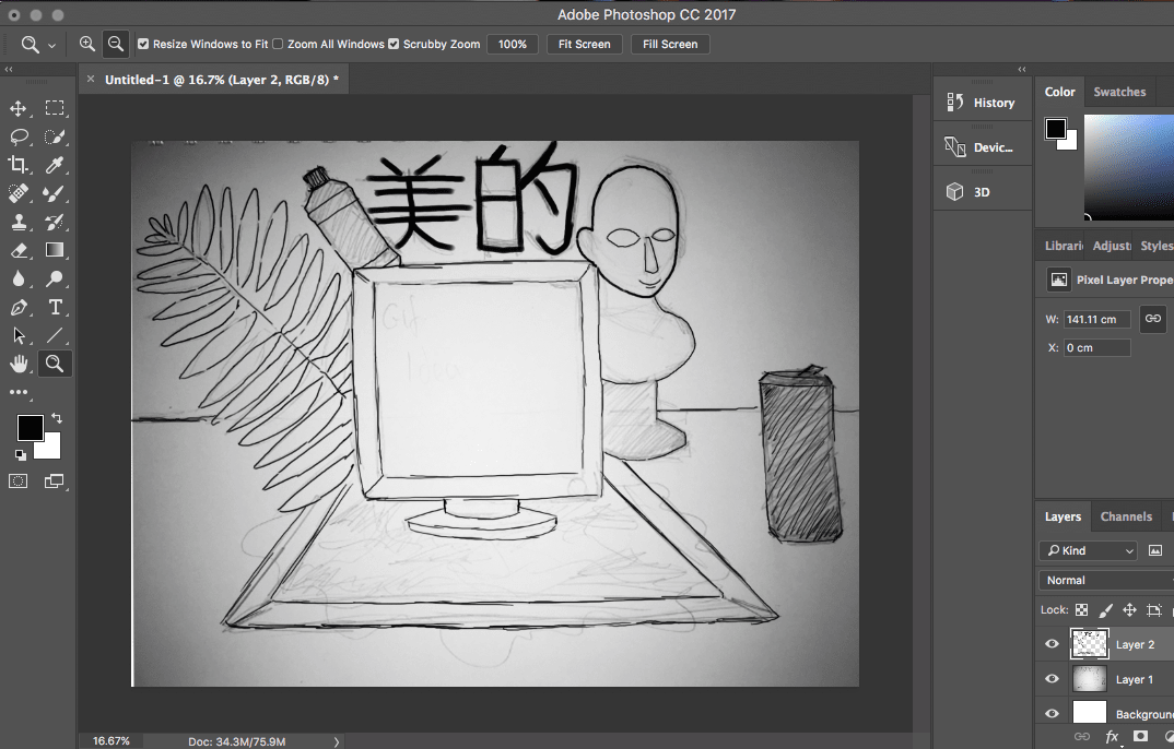
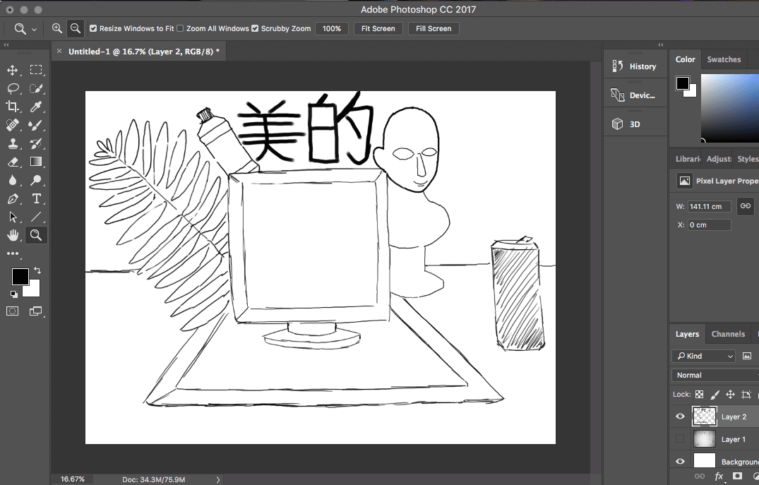
I removed the origonal pencil drawing, allowing me to work on a white background and seeing the image clearly.
I've chopped up and manipulated various stock images from the internet, they aren't by any particular artist. they're just pictures of plants, water, and a 3d-rendered fake statue. I create a gradient background. i really like these colours, and the different versions of them, like my other work i try to use these "kinds" of colours wherever I can
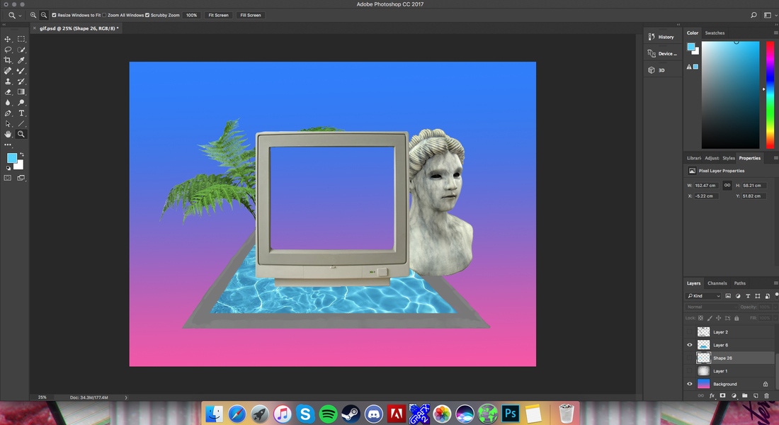
I use the "curves" tool form earlier to change the colours of the stock images, and add the picture of the Fiji water bottles on pink/blue tissue paper Itook at college, it is my own image. what I like about it is you can see the pink and blue sittue paper shine though from behind the tranparrency of the bottle, magnifying the colours. the japanese lettering has been layered over with an image of Tokyo nightlife via the technique I had used earlier with the man's sihouette.
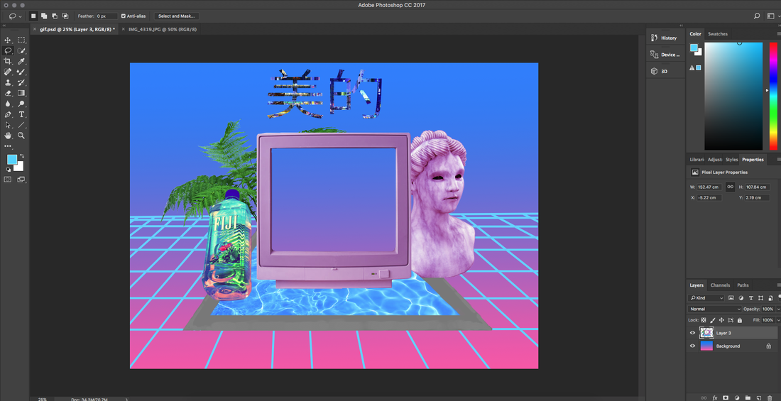
I condense the images into JPEG images rather than photoshop images, they are a lot smaller and easier to compile in videos and gif images
I've added some of my origonal pictures as fillers on the screen, perhaps to re-inforce the messege of my picture, about products, the internet, and western life with the internet, along with a few frames of static, to create a transition between each.


the final product
Photos of letters
Here are some photos of letters I decided to take in my home to help me with my project, from Various posters, signs and boxes. They have a very bold imprint about them, which for me is very eye catching. not to mention some of them are metalic and futruistic in appearance, which is the aesthetic im heading for. the A, E, and F are very thick, and make a lasting impression due to this. I'd like to incorporate *similar* shapes in my work. they're not just letters, they're shapes.


Working with prints of letters.

This is a block print. After my initial failiure with this experiment with the cardboard letters up above, I had decided to change stratagey, Instead, I used Mountboard cart, on a mountboard slat. I carefuly sketched out the letters, inspired by the photos I had taken, taking into account all the various shapes and fonts, decided to print the word "internet" to achieve this I had to draw, and cut out the entire word backwards, in order to print the word the right way around them the ink is transferred across onto the paper
Digitally realising the peice.
Using the picture I took above, I used the Quck select tok as een in previous experiments, to highlight the shapes made by the print, the word was printed the right way around and all I had to do was hilight the inked-up parts of the word in photoshop. In the computer now we have a digital version of the word.

After some cleaning up, I managed to create sharp edges on the word by cutting the rough edges off the origonal word in some areas, and genrally cleaning it up. it it is not a different version of the word. It is simply the same exact picture, just made more neat. I by no means claim this to be "better" than the origonal because of this however. I do appreciate the raw, rough edges of the origonal work, I just thought i would put in the extra effort and try an alternate version of the same word, whilst still retaining the same exact style from my origonal prints.

Alternate colour edits of the word. Experimenting with colours in the word.


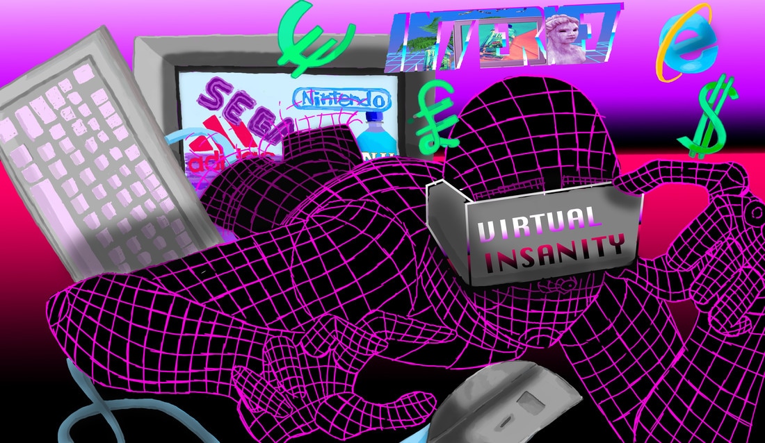
Virtual Insanity
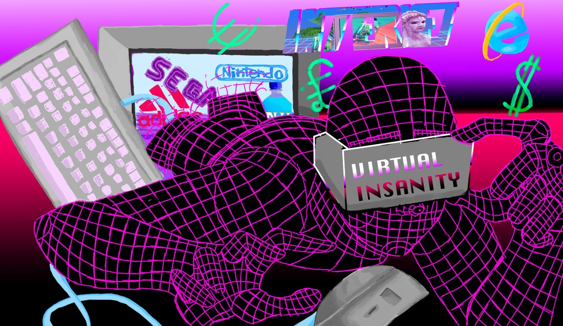
a piece I dubbed "virtual insanity" is another outcome I have come up with in these past few weeks. It has come to my attention that in this age, as we progress into the fugure, we are blinded by the fake realities we dwell in. something that is often seen as virtual reality, The internet culture, online capitalism, advertising, and being so self indulged in it all you don't take a true look at the world around you. for this piece I used photoshop, combining motifs, Fonts, and messages from my previous works. you can see the many brands such as Sega, Nintendo, Fiji water, and Adidas. This person could be anyone really. anyone ingaging with the busy life of a millennial. someone who " typically use the early 1980s as starting birth years and ending birth years ranging from the mid-1990s to early 2000s" Wikipedia definition
What I like most about this piece is the figure I described as a millennial. I like the colour scheme I picked out for them. the strong hot pink against an even stronger black. stripping back the complexity of the human form, and using strong pink lines to make them look like a simple computer generated person, lines of code to perhaps try my best to describe their descent into internet madness.
What I like most about this piece is the figure I described as a millennial. I like the colour scheme I picked out for them. the strong hot pink against an even stronger black. stripping back the complexity of the human form, and using strong pink lines to make them look like a simple computer generated person, lines of code to perhaps try my best to describe their descent into internet madness.
Acting on Feedback
|
In my feedback I was given some good advice, and although my Critic was unable to reach my website for my own reasons, they were unable to see the presentation of my work, however aside from that they gave me a peice of interesting feedback regarding my previous piece: the keyboard warrior , AKA virtual insanity. She said that while the prominent figure in the centre was very well drawn and well developed, the symbolism, and the lines in the picture needed to be cleaned up a bit. and In this second development, I've added Cleaner lines on areas of the picture, bolder currency symbols to really drive the point of money in this picture home, and added shading to add depth where appropriate. I hope these improvements will make the piece better
|