Gif test
|
Digital manipulationI Decided to make gifs and animatics out of my Frames to create a short, rough flow of movement. to see if my 40 frames would flow as an animation, It was successful because it does appear to flow nicely to the eye, however I would need to use many many more frames to create a story (25 fps) in order to make it flow even smoother and as I only have 40 frames, i would prefer to keep it on the storyboarding and storytelling side rather tha focussing on movement alone.
|
|
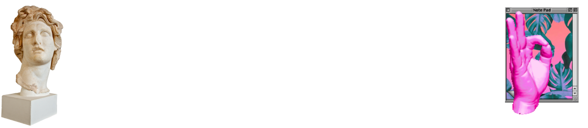
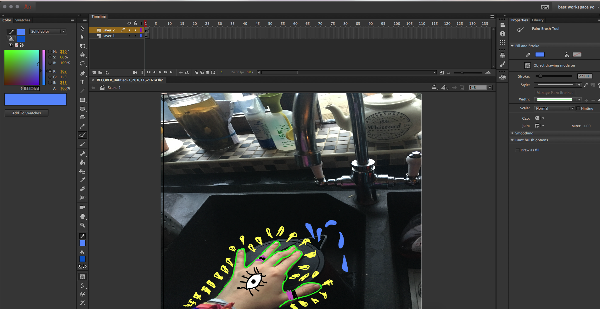
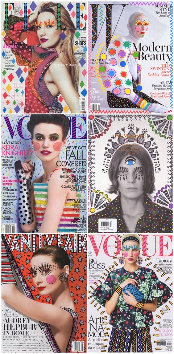
After speaking with rose Bramwell , i have been encouraged to edit my photographs in a creative way, I was linked to the Pinterest resource group https://uk.pinterest.com/pin/426927239657542635/ to have a look at the way images can be manipulate and look like they've been doodles no to create a quirky aesthetic and cartoony style. this art is known as "Re-cover" art by a Brazilian interior designer Ana Strumpf and re-covers and designs Magazine covers. Taking a look at this kind of art has inspired me to pursue the same creative path, combining this with dadaism is surely to create something entirely new. i plan to set forward on this task by creating a gif with my short sequence of images, combined with the style of Ana and Dadaism. creating a short sequence and collages. i have decided to use Adobe anime (formerly known as flash professional) so create this work. you ca see how i draw over the top in the picture on the left.
|
http://www.freundevonfreunden.com/interviews/ana-strumpf/
- digital - First draft story
I put together a character profile and designs for a a story arc I had created. Though after several weeks i have received feedback that it wont be successful within my project. i think this gives me a chance to reflect on my work and understand why I would benefit for doing something else, this show i have taken the character through a process, if you take a look in my book i have played out a story. thought about character development trough dadism and listed my sources such as hannah hotch. just because i have moved onto a different idea doesn't mean i can't be inspired by the same artists however, and will be transferring my knowledge over to the current idea in motion. I have decided to go back with my first idea and develop that some more too with the tea, as it has many complex shapes i can work with.


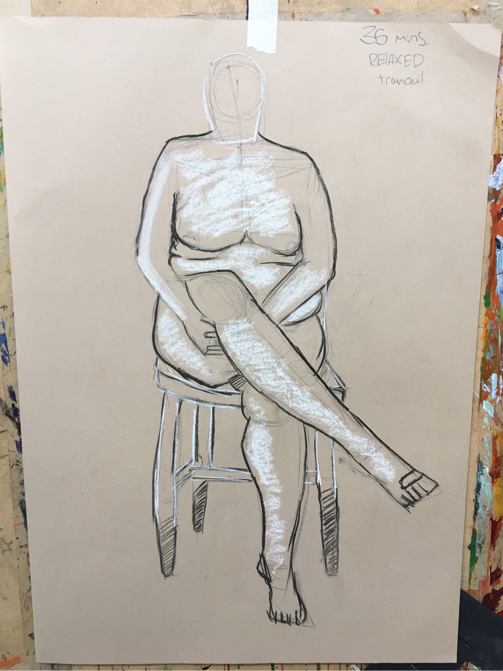
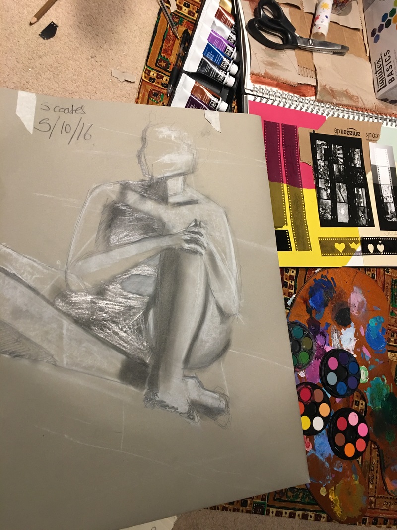
Life drawing 9 (final)
i produced my final two life drawing pieces in today's session. As you can see I've improved a lot, and have developed many different techniques, all my perceptions of reality, the human form, light and shadow have vastly improved. I can safely say I am a better artist now because of this particular segment and The skills I've learned through practicing weekly. I hope to continue these tactics onto my future work. We also worked on black paper, which inverted the shading almost. We had to work more on drawing attention to the light as the shade was already established. This was important because changing the colour of the paper can change the mood from
hally to sad. And if deciding a certain mood you can remeher to use a certain type of paper
hally to sad. And if deciding a certain mood you can remeher to use a certain type of paper


life drawing 8
same model as last week, only I've performed much better. I've really captured her curves and the way she was sat, her posture. She was sat directly which was good, I managed to utilise this to work on my foreshortening more. Which is one of the greatest challenges in drawing people, or anything. I managed well, if you take a look at the left thigh. We're running out of lessons now, but I think I've really come along.
Ink printing results and potato printing
Our pictures were put through a machine thT blasts them with light. Our pictures and drawings were burned onto special see through plastic sheeting and handed back to us, which was very interesting to see and all our marking were inverted, black to white. We have a copy of the oattern now as well as the original. In class we were tasked with potato printing which reminded me of primary school, nevertheless I created some interesting prints as you can see below. These were important as it helped me understand aesthetic in printing and these last lessons have helped me print effectively and to see pattern. The panels show a few preliminary designs that could have gone onto a potato.


life drawing 6
today we had the model that we were faced with in our very first lesson.in my first lesson I was vet inexperienced and it shows. My technique was ammeter. Baseless and guesswork. Through these pictures I can see I've come along a lot.


ink tracing
Our teacher helped us choose several images from our sketchbook, some were photographs from our time at Kew Gardens, some were the etchings I had made from the ocean jasper, these were then photocopied and enlarged, using ink and a special plastic material with a sticky side and a smooth side, we painted onto it. It created a bold line and smooth texture, we've now handed in the piece for next week. I managed to create the two images out of the photocopies you see below. Updates on this soon to come.


Photographic Storyboard example
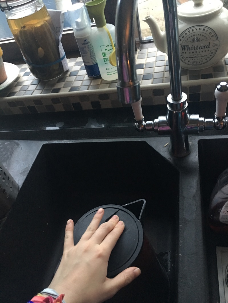
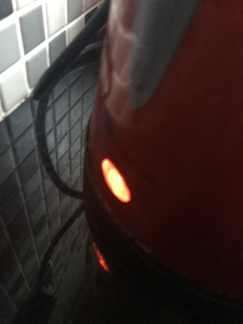
After I had done my primary research on Storyboard artist Barry Jhonsson, found here I was inspired to make a storyboard of my own, and used the very basic process of making tea as the base "storyline" as you can see, I have come up with 40 frames to demonstrate how tea is made, it tells a story, and keeps the action concise. the angles are pretty simple for this example but it's to keep every part of the process, say the kettle, Tea cup, Sink, ect. in frame to show they're being used. where i felt i had succeeded in this process, is shows in the fact that I got exactly 40 frames. I took other frames out that might had taken it over the limit, but evaluated each picture carefully before deciding what to cut and what to keep I eventually ended up with the top 40 frames which I deemed most relevant to my story, you can se I have done this because what you're seeing below are my final choices. At college I have done a drawn version of my story art in Fine liner and water. this can be found my my sketchbook along with written work about my interpretation of the frames if you would like to compare my take with the photographs.


life drawing 5
today in life drawing we worked more on integrating the background in our pictures, very simple, no real technique was taught so it was more about what we perceived and our own take on drawing it, mine turned out okay if not a bit flat, but it wasn't awful. My form is coming along really well however using the same technique as I've learned over these past weeks has really helped. my teacher seems to be quite pleased, so I think I'm finally starting to get it.


Collograph printing.
The following day after initially creating our printing peice, the varnish had dried and we were ready to push it through the press. We soaked a price of paper, much like we did with our previous etching prints. The result for the first time I consider a success. Reason being that the outcome had a clear impression on the paper. And I can see clearly where the textures had been forced through the paper, and all the extra details like stitches, the button, the headphone peice, etc. If I could improve it in the future I might not put the varnish on so strong as the water on the paper re activated the varnish a little, and maybe even the glue too. Small layers of paper came off on the release, and stuck to the print work.


Textiles
today in textiles we tried a new technique which was sort of like screen printing but in the wrong order. Instead of lining the a stencil and paper up and pushing ink through it, we simply painted into the screen itself, which seems a bit unorthodox however after letting the ink dry, we stuck down out paper and THEN pressed the solution through, thus re-activating the dried ink, and that made the print. I liked how simple the process was and that it was a bit unusual the teacher claims she positive she invented it, so I'll have to take her for her word as I don't know. I have about printing! It was very fun and I made some good prints. However if I had to critique the method I'd say it's not as smooth around the edges as the previous method, and it's harder to make shapes by painting straight into the screen, which made my work look worse, but it's a learning curve, and other than that it was a very new experience.
Making printers
today in our practical session we explored a range of printing, our goal was to cover a seat of wood in various textures and materials, some I brought from home, some from the studio, and other parts you may recognise as Peices of my previous deconstruction work. Here I am attempting to re create one of the pictures I took of a clown fish at Kew Gardens. I reckon I picked up on the basic shapes, as well as the angle of the fish in the picture, it looks like a blob on the page, however it is the fish in the water. From here we will use them as the basis of a new printing technique where instead of etching like we did before, we are going the other way and are makingoitward facing mounds on our slat of wood, and texture.


life drawing 4 - october 12 2016
Today in life drawing we didn't pick up any new drawing Technique. however we did take a look at combining these techniques we've picked up across these past few weeks. I have produced my best life piece so gar because of it, and much like last week we used the combination of light and dark block colours to define the 3d space around the subject. i did another drawing alongside this main one above, however i thought id focus on this one because it's a lot better in my opinion.


Today in deconstruction october 12 2016
Today in deconstruction we were presented with our deconstructed objects alongside the following mannequins, and it was up to us to create a look based off what we had in our box. As you can see below, we constructed a look for a mannequin, took some pictures to show our ideas, as you can see below we had a range of ideas form futuristic to patchwork and messy. we then proceeded to Deconstruct the piece and strip it down to its base elements of the outfit and make a new look with fewer parts, after which we rotated to a different mannequin entirely and started again.


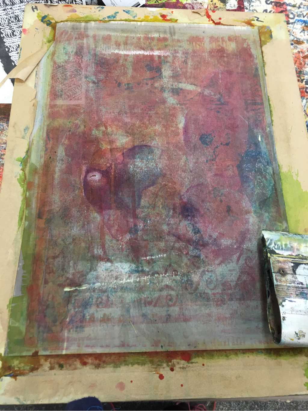
Screen printing and the dye result
From my photos from the Museum, I had to pick a few that I deemed most appropriate and realistic for a print on a silk screen. I narrowed my choices down to 4 major sketches i thought would work and then to a final choice, I went with the foot of a T rex as the shapes are very specific and the shape of the foot is very iconic ( maybe it's a lucky foot?) in any case I proceeded to make a larger drawing, and carefully cutting out the pieces to form a stencil, I then taped the design and the fabric to the screen and the table before pressing the ink through the screen. it was a very fun process and i managed to get some interesting designs out of it, including a print on my The Dye project which finally came through it's second around of Dyeing which i think looks very nice. the pink dye mixed with the blue from the previous Dye session has fused to create a lovely plumb/purple colour. I really like it and will be placing it in my journal along with my prints when they're finished drying this week. think of this post as a combination of my tie dye results and the beginning of my printing process rolled into one.


Impressions in Clay
We were tasked to Create impressions in clay using the roller machine to platen it then create shapes by pressing various things into it. I chose to use old computer circuit boards as my impression tool as it has many intricate shapes and when looked at with a certain eye can look like a skyline or city in my opinion, I used this on a "landscape" base i had created by sculpting a big mountain and a rough surface with the clay already, after painting and then Pressing the circuit boards down, I had created an interesting shot, which upon feedback was told it looked like a the world from game of thrones and lord of the rings; a fantasy world. which i was very pleased about because my aim was to create a unique landscape with this technique, and demonstrate that with appropriate paint and shape, you can make clay look like anything.


Deconstruction 2
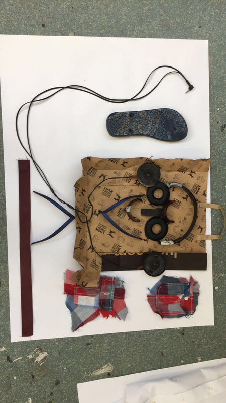
After Deconstructing a pair of headphones and various other objects like a button shirt, a bag and flip flops, I had laid them out on the paper in a way i like, in this particular instance I created A face, simply because all the pieces fit into that shape right and looked very cartoonist. after finalising the layout I applied different inks and printed them onto the paper to re-create my design with the printed shapes. I used black to start with, then used blue and Red, although i mixed white with the two primary colours. I did this because I wanted to turn them into a sky blue and pink which looked a lot more pastel. I kept my objects after I was finished I was encouraged to keep the stray object for future projects, Perhaps Sculpture?


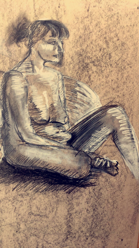
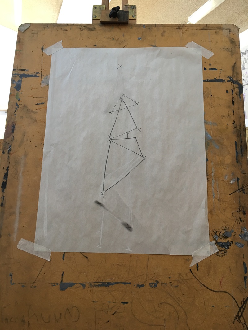
5th october 2016 Life drawing 3
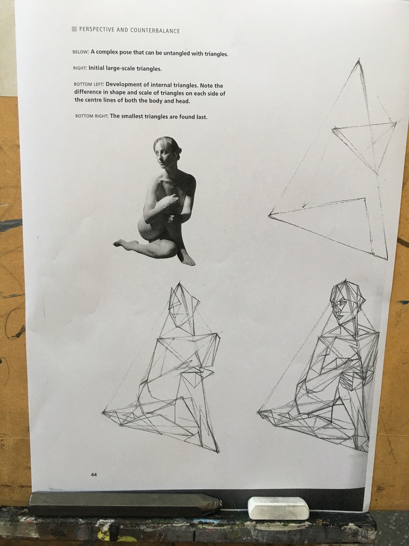
Today our main focus within the lesson was triangles, Another structuring technique designed to help us establish proportion and a skeletal structure before we start to draw the form of the person itself. In my experience i didn't much understand the triangle Technique as much as i understood the cats crave and the "star point technique" as triangles aren't as easy to control in my opinion. however it was my first attempt so I could easily get better with practise. i did however succeed well in creating light and shadow within my work, using white chalk and black graphite sticks, it, despite my struggles with my proportions slightly, is probably my best piece of work so far, and each lesson i take my work keep getting better. the less overly complicated lines i draw and the more I focus on implied line, surprisingly it's working out to be more detailed. In the final sketch as I mentioned I Combined all three of my new skills, I drew the base with the triangles, Connected them with the Points and cats cradle, And then involved simple circles to start the form which worked pretty well in my opinion.
|
|
|
Deconstruction
This week in textiles |
I used different action to deconstruct my objects. i used a saw iced with fast-paced motion, as well as small movements with a screwdriver against the rigid material of the headphones and bouncy surface of the flip flops with my deconstructed objects I organised them into a smiling face as the pecked seemed to fit well.
|
Today in Textiles we took our batik a step further then when we started as initially we had covered the cloth in wax in various areas then coloured. we returned this week to find we were doing another layer on top of that. so again we used wax on the now coloured surface, however this time the aim of the wax was to preserve the colour that was already there so when we went to was a new colour on top, the areas that had been waxed were the same colour as before. this can be used to add detail. if i had to improve anything about my work it could be my choice of colours. I didn't really know what colours went well together on the surface of that particular material as it was my first time handling batik, so the colours washed together poorly. elsewhere I had Started my Tie dye, After Dying it blue, We are now to tie it back up, and dye it again. I'm looking forward to seeing how my first Tie dye works out. see below.


Dry-point Etching
I took a Design from what I had recorded from the Oxford trip and Etched it into a plastic called Rhenelon. More about this in my project book, but essentially it is the plastic used to create the print, after which I Covered in ink, then removed the Excess using a material called a "scrim" and pressed though a machine. The intense pressure seemed to create an impression on the wet paper ( i tried with dry paper too) the designs looked very interesting and i can see where my use of line came into play. they looked very interesting on the different kinds of paper which you can see in my project book if you'd like to see the plastic first hand, o down below for pictures.


developing techniques
We were given the task to create a number of drawings from decaying plants within the lesson, the amount of drawings we had to create was 20 at the very most, as you can see slow i have used a range of media and materials to create work from what i saw, i didn't reach the goal of 20 pictures however i did create a range of interesting aesthetics and environments within what i saw, combining wet objects with dry materials like water and pastel. used different coloured paper to create variation of mediums. I used several techniques such as cross-hatching, and smudging different kinds of pastel together. my favourite medium to work with was the fine liner and creating bold and bigger more obvious lines, i'd say that's my most comfortable area in this section.
My use of time was spent on testing out different media rather than capturing the shapes truly. if i had to repeat this class again and change anything i'd try my best to create more drawings quicker and to not spend as much time on each drawing and perhaps capture the movement of the object a little better.
My use of time was spent on testing out different media rather than capturing the shapes truly. if i had to repeat this class again and change anything i'd try my best to create more drawings quicker and to not spend as much time on each drawing and perhaps capture the movement of the object a little better.


Life drawing 2
My second session at life drawing went a lot better than the first. I was challenged to focus mrs on the cat's cradle and the proportions of the figure, i think have a btter grasp now on what it means to capture the human figure, I'm not saying my work was miles ahead than last time or that it's flawless it just felt a lot more natural to draw and looked better on the page, this proves i have gotten a hang of the Pencil measurement technique that i had learned last week and had properly utilised it in practice.
i used a new skill this week that i hope to improve upon, in which i create a skeleton or "cats cradle" within my drawing at first to properly make the proportions correct, as a sort of bonus or add on to the previous measuring technique.
i used a new skill this week that i hope to improve upon, in which i create a skeleton or "cats cradle" within my drawing at first to properly make the proportions correct, as a sort of bonus or add on to the previous measuring technique.


Life drawing 1
This was my very first session at still life, It was my first attempt at trying to draw proportions. it was a formidable effort on my first try, I used brief pencil marks and was Taught about the Pencil measuring Technique:
1) Hold your body rigid and extend your dominant arm (usually the right arm), pencil in your hand, to its full length.
(2) Place your thumb against the pencil as a guage.
(3)Bring the pencil on a line with your eye and the object that you are measuring.
(4) Try to find one part by which you can then measure the rest of the object.
(5) Once you find a part to which to measure the rest of the parts of the object, you can then proceed to put in the object’s details, still using the same scale of measurement in which you established.
http://www.drawinghowtodraw.com/stepbystepdrawinglessons/2010/01/how-to-find-measurements-proportions-and-angles-to-draw-with-pencil-thumb-method/
I had the right idea, however I can improve on my technique and really interpreting the measurements correctly onto the paper.I also don't think incorporating pen straight away was a really good idea. I'm hoping my next sketch can focus more on the correct measurements rather than focussing not he details.


|
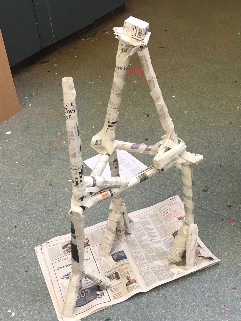
I was tasked to build the tallest tower with a team to support a weight. I worked well with my team and created a free standing structure that did just that. however our tower was not the tallest. we built our tower more focussed on structural stability first because we were unsure how high we could build without falling. It looked better this way. the Aesthetic was better.
Our tower excels in aesthetics. and it is "stronger" in that sense than the others. ours took longer to construct because we spent more time one the strength on the tower as a whole rather than the height of it, to stop it form tipping over. |
